“Your aunt Joanna has let herself go,” Barty said. “I saw her at the Devonshires’ the other night. She sat down and her bottom spread over the sofa like a ripe Brie.”
“Poor Aunty Jo,” Emeline said with feeling. “She never got over losing Topper.”
“I thought her husband was called Charles?”
“He was—Topper was her Pekinese.”
Hannah Rothschild’s recently released The Improbability of Love is rather wonderful. She manages to weave a fast-moving plot into fascinating study of wealth in 21st Century London and its effect on the art world. Among her cast of characters are exiled Russian oligarchs, desperately poor English noblemen, a billionaire art dealer with a Nazi past, unscrupulous art experts, and sell-out artists. Rothschild knows this milieu because she is part of it, and as such, it is remarkable that she is willing to take it down quite so thoroughly. Perhaps her friends and acquaintances failed to recognize themselves?
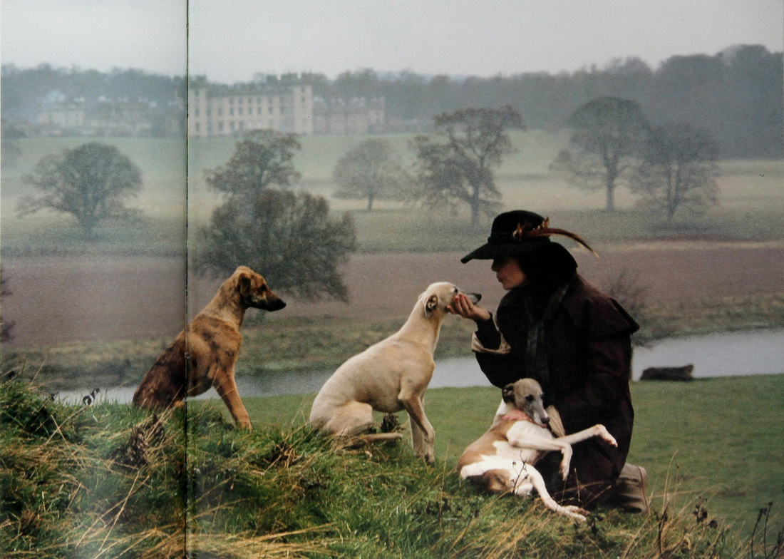
 The book is also very funny, and humor does cushion a blow. In one passage Rothschild simultaneously captures the upper-class English person's affection for pets and penchant for retaining childhood nicknames: Image Credit: The English Dog at Home, Photographs by Geoffrey Shakerley.
0 Comments
Elizabeth Taylor’s third husband Mike Todd died in an air crash aboard their private plane, The Liz. It was a terrible tragedy, and the only marriage for Taylor that ended in widowhood rather than divorce.
Todd was not the only passenger who perished in the crash. Art Cohn, who was writing an authorized biography of Todd, was also aboard. He was a screenwriter but not an A-List player, with just a few credits for “Additional Dialogue” to his name. It is a credit that no longer exists. The Writer’s Guild long ago did away with it. The day after the mishap, Ivan Moffat was dining at Charlie Feldman’s, and of course, Topic A was the tragic air crash. One woman remarked, “What an awful thing for Art Cohn’s widow, that almost every account of the crash, the press hardly mentioned his name.” Billy Wilder, also in attendance, deadpanned, “Yes, at least they should have given credit for Additional Dying.” Via The Ivan Moffat File by Gavin Lambert. The Pursuit of Love was the novel that put Nancy Mitford on the literary map. The English edition came first in 1945, and its runaway success prompted Random House to release it in the United States. It was the first work by Mitford to be published stateside. In spite of Mitford's well-known dislike of Americans, she must have been delighted that her novel reached the U.S. market. She was then living in Paris, and strict British post-World War II currency restrictions made it difficult to access profits from sales in the United Kingdom. The American royalties, however, could easily bypass her home country. The dust jacket illustration for the English edition was by Mitford's friend Mark Ogilvie-Grant. Its illustration is more conceptual than its American counterpart, featuring a line drawing of Cupid and his arrow. Verdict. The more elegant English edition. There is something cloying about the American artwork. The color scheme does not pop. Moreover, the woman in the in the long blue dress and straw hat seems to have stepped off the pages of Little House on the Prairie. We fear that if Random House accurately assessed the taste of the American audience, then perhaps Mitford had some justification in her antipathy for Americans. An early printing of the English edition is available here. In spite of our dislike for the American edition cover, we note that it did land in some interesting libraries. We once sold a copy from the collection of Elsa Schiaparelli with a third party gift inscription from Diana Vreeland. Some other books from Schiaparelli's library are available here, including a biography of Oscar Wilde and a first edition of Salvador Dali's only novel, Hidden Faces.
The concepts for the American and English editions of Wait for Me! by Deborah, the 11th Duchess of Devonshire are quite different. Farrar, Straus, and Giroux decided the book would be more appealing to the American audience with a vintage glamour shot of the Duchess by fashion photographer Norman Parkinson. The title is abbreviated to simply Wait for Me! Memoirs. Her rank, absent from the English edition, was given prominence, likely on the assumption that her status as a duchess would capture the attention a browser who never heard of her or the Mitford family. The English audience knew the Duchess as a contemporary public figure, and as such, the English edition featured a recent photograph. In it, the Duchess proudly displays the prize-winning hens that by this point were as much a part of the Mitford legend as tea with Hitler and cozy dinners with John F. Kennedy. Verdict. Tie. You cannot go wrong with the Duchess of Devonshire. Youthful glamour or earthy patrician are equally acceptable. A copy of Wait for Me! Memoirs of the Youngest Mitford Sister signed by the Duchess is available here.
By the time her memoirs were published in 2010, the Duchess was officially a dowager duchess and nonagenarian. Advanced age, however, did not prevent her from traveling across the Atlantic to promote her book. Below is a video of her appearance at the Frick Collection in New York City, "Fizz and Sparkle: The Effervescent Life of Deborah, The Dowager Duchess of Devonshire." Living in Vogue is a compilation of interior profiles that originally appeared in British Vogue. When it was published in the United States, the name had to be changed to English Elegance to avoid confusion with American Vogue. Both are now out of print, and what a difference a name makes. An attractive copy of Living in Vogue sells for double or triple the price of English Elegance, even though it is the same book. The American edition is currently available via Nick Harvill Libraries here.
Verdict. The American. But for title and saturation of the jacket photograph, the books are essentially the same. We are going with the thrifty choice, the American edition that sells for less on the resale market. Gertrude Stein's Wars I Have Seen (1945) shows just how divergent the American and English concepts for dust jacket art can be. The American edition was more graphic, in keeping with the modern style that would become even more prevalent in the decades to come. The English edition featured an attractive watercolor by Gertrude Stein's friend and occasional houseguest Cecil Beaton. It depicts Gertrude Stein and Alice B. Toklas and their poodle Basket in their garden at Bilignin, their country home about five hours southeast of Paris. They took refuge there during World War II, which Stein covers in the book.
Verdict. The English. It is one of Beaton's better illustrations, and it more properly conveys the meaning and tone of the book. Besides, the graphic style was to become overdone in the coming decades. Evelyn Waugh's Scoop is a hilarious send-up of the great London press barons. It involves a case of mistaken identity and travel to an exotic country. The English and American editions went in distinctly different directions for the dust jacket. Chapman and Hall chose a newspaper masthead that included a photograph of the author himself. The American publishers selected a Harry Beckhoff illustration that conveys the exotic setting in which much of the action occurs.
Verdict. The American. Harry Beckhoff was a marvelous illustrator, and this is among his best work. It conveys a sense of fun and adventure, seemingly channeling a Raiders of the Lost Ark that would not debut for another forty-three years. A copy of the American edition is available here. Even though Americans and Brits speak a variation of the same language, it is common for the United States and the United Kingdom to publish separate editions of the same title. When a book travels across the Atlantic, the editors typically do more than simply remove or add a "U" to words like "candor" and "flavor." Nearly always, there is a different concept for the dust jacket. One reason is because the jacket is a means of advertising, and American and British audiences have divergent interests and sensibilities. In the case of autobiography, it is also a question of public image. Consider the case of My Turn, The Memoirs of Nancy Reagan. In the American edition, the former first lady appears sans jewelry, wearing an all-American red-checkered blouse, as if she were en route to a church picnic or Walmart. In the English edition, she was able to dress more elegantly, as if she were preparing to meet Lily Safra for luncheon at the Savoy. One imagines the English version was more to her liking. It is easy, however, to see the logic behind the dressed-down look for the American edition. She spent the previous eight years battling accusations that she was overly obsessed with clothes (see: Nancy Reagan, A First Lady's Style). Verdict. The English. We like posh Nancy! Photo credit: Double Exposure, Take Three.
![]() One of the frustrations of bookselling is the challenge of connecting with those who would benefit from one's services. For example, consider the case of the singer Madonna’s 2007 visit to the Deborah, the Dowager Duchess of Devonshire at her dower home, the Old Vicarage. Nick Harvill Libraries had the perfect hostess gift for the occasion: a letter of literary significance written by the Duchess's sister Nancy. Instead, Madonna gifted the last surviving Mitford sister with a copy of The Year of Magical Thinking, inscribed not by the author but by Madonna herself. Curiously her third party gift inscription does not appear on the flyleaf as one might expect. Rather, it is wedged on either end of page containing a photograph of the author Joan Didion and her family, as if Madonna were part of the clan. The inscription reads, “For the duchess, I hope this book inspires you as much as it inspired me! Thanks for the hospitality, all the best Madonna.” One wonders if Madonna's sentiment might be a bit sincere for an octogenarian English duchess known for combating life’s challenges with a sharp sense of humor and a stiff upper lip. A more interesting approach with the inscription might have been to note the attenuated Mitford link. The Year of Magical Thinking was the most celebrated book on bereavement since the Duchess’s sister Jessica Mitford’s sardonic exposé The American Way of Death became a runaway bestseller in 1963. An even better choice would have been to call Nick Harvill Libraries. We then had in our inventory a perfect gift for the Dowager Duchess: a two-page handwritten letter by her eldest sister, the author Nancy Mitford. As Nancy's literary executor, Deborah housed Nancy's papers, along with an impressive archive of Mitford family material, at Chatsworth, the Devonshire family seat. One item missing from that archive was a droll handwritten letter Nancy wrote in response to a factual error in her bestselling book, The Sun King, which we included in a 2007 print catalogue (we were not yet online). The original recipient of the letter was a descendant of the American branch of the Francine family. He complained that Nancy erred when writing that his family died out when the last of the Francines was guillotined during the Terror. She offered a poison-tipped apology in a handwritten two-page letter, archly suggesting that immigrating to America was equivalent to extinction. “One must say that in the eyes of the French the New World counts the same as the Next World,” she wrote. It is a classic Mitford tease and would have delighted the Dowager Duchess who surely would have deposited the letter into Chatsworth's Mitford archive. The copy of The Year of Magical Thinking inscribed by Madonna to the Duchess of Devonshire is part of the March 2, 2016 Sotheby’s London sale, “The Collection of Deborah, Duchess of Devonshire.” The photographs are from Wait for Me! Memoirs of the Youngest Mitford Sister.
“Liz has always had a charming way of minimizing the public hurricanes that have raged around her. Perhaps this is because she is always operating from the comparative calm of the eye of the storm.” Peter Harry Brown, The MGM Girls, Behind the Velvet Curtain Another reason that might be is because, unlike many Hollywood icons, Elizabeth Taylor never took herself or her glamorous image too seriously. Her self-deprecating graffiti on this photo contact sheet is but one example of this lack of reverence. The MGM Girls, Behind the Velvet Curtain is available via the Nick Harvill Libraries kiosk at the Sunset Tower Hotel in West Hollywood.
Image Credit: Double Exposure, Take Four |
Archives
October 2020
|